
case
eleven:fourteen
an airport coffee spot
concept
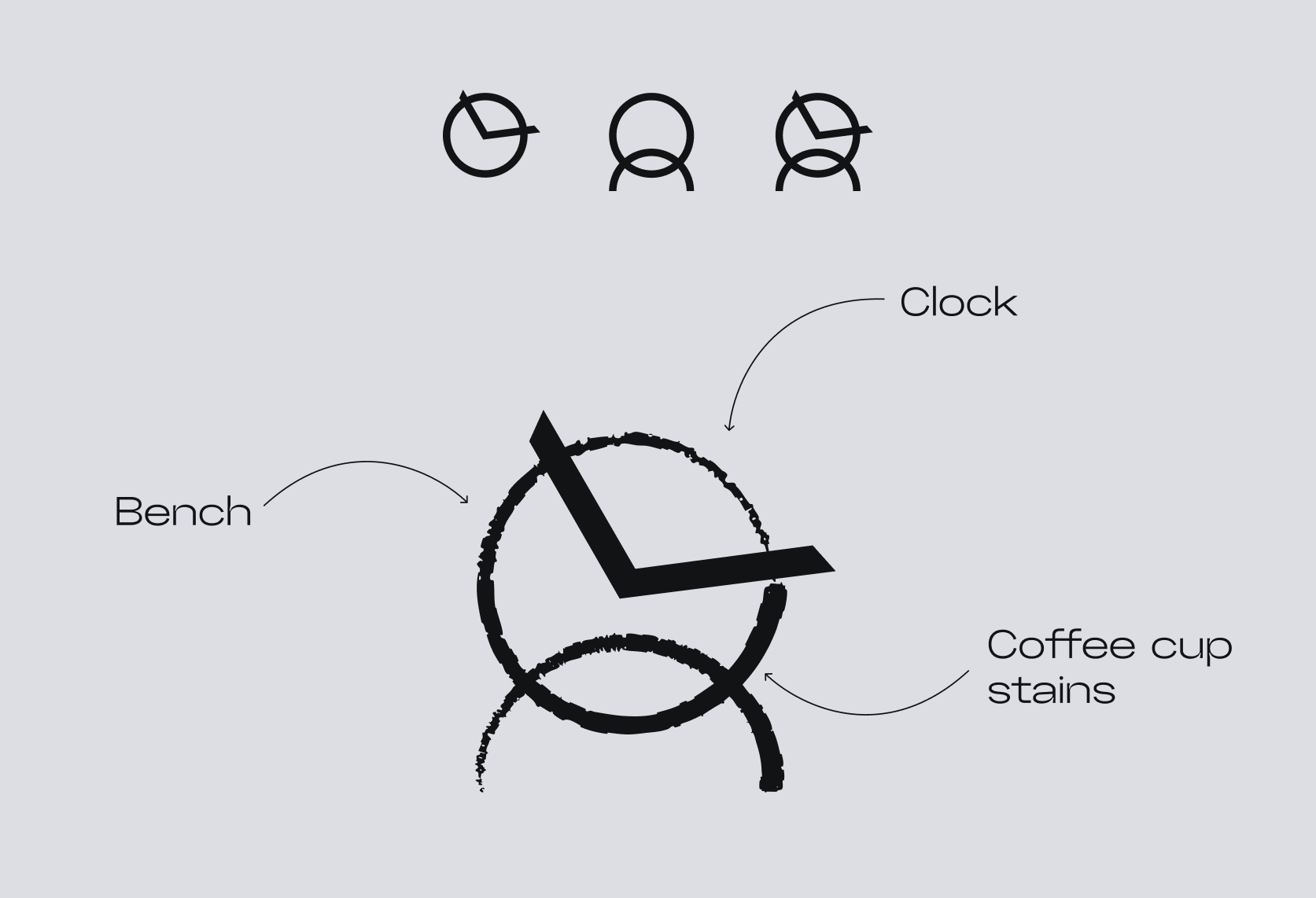
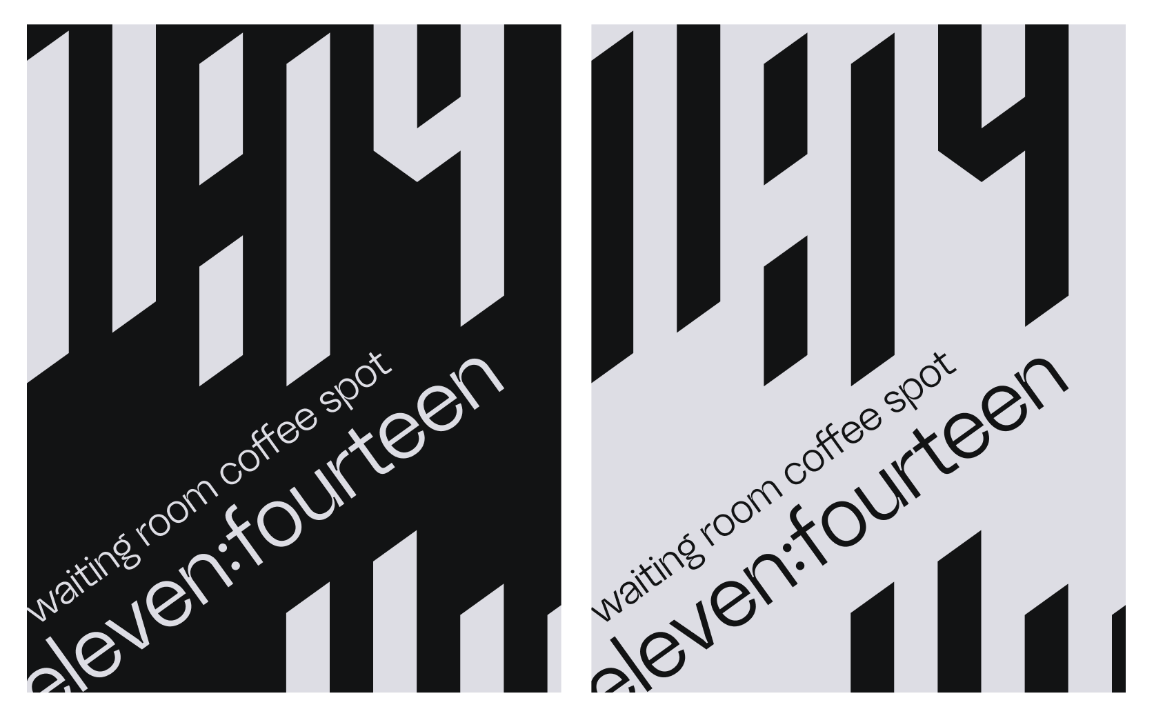
a coffee chain built exclusively for airports — the one place where waiting has a hard deadline and missing it has real consequences. the name is abstract, drawn from the logo: a mark that fuses a clock face and a bench into one line, the two things a traveler needs most while sitting at a gate. positioning line: "11:14 — a taste you don't have to wait long for."
aesthetic direction
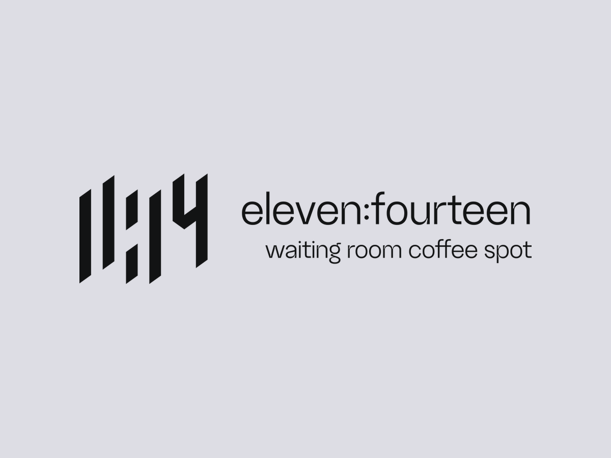
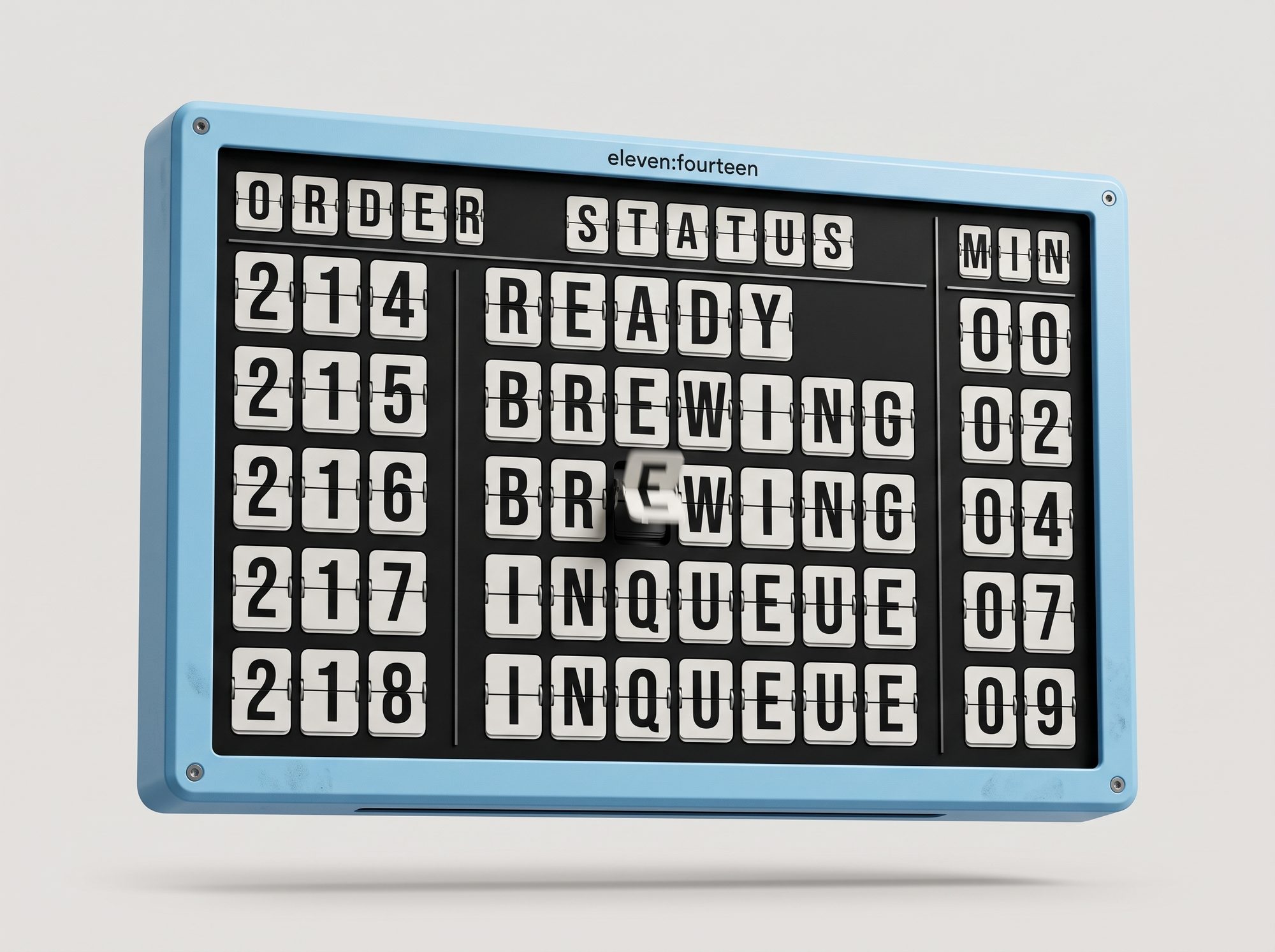
- high-contrast black and white, bold vertical strokes styled after split-flap departure boards — the "11:14" numerals are built like mechanical display digits, not softened or rounded.
- logo: a single continuous line reading simultaneously as a clock and a bench — literal enough to parse instantly, abstract enough to function as a standalone mark.
- deliberately un-cozy. no warm wood tones, no soft edges — this is efficient, confident, built for someone checking the time every thirty seconds.
palette
the reminder device
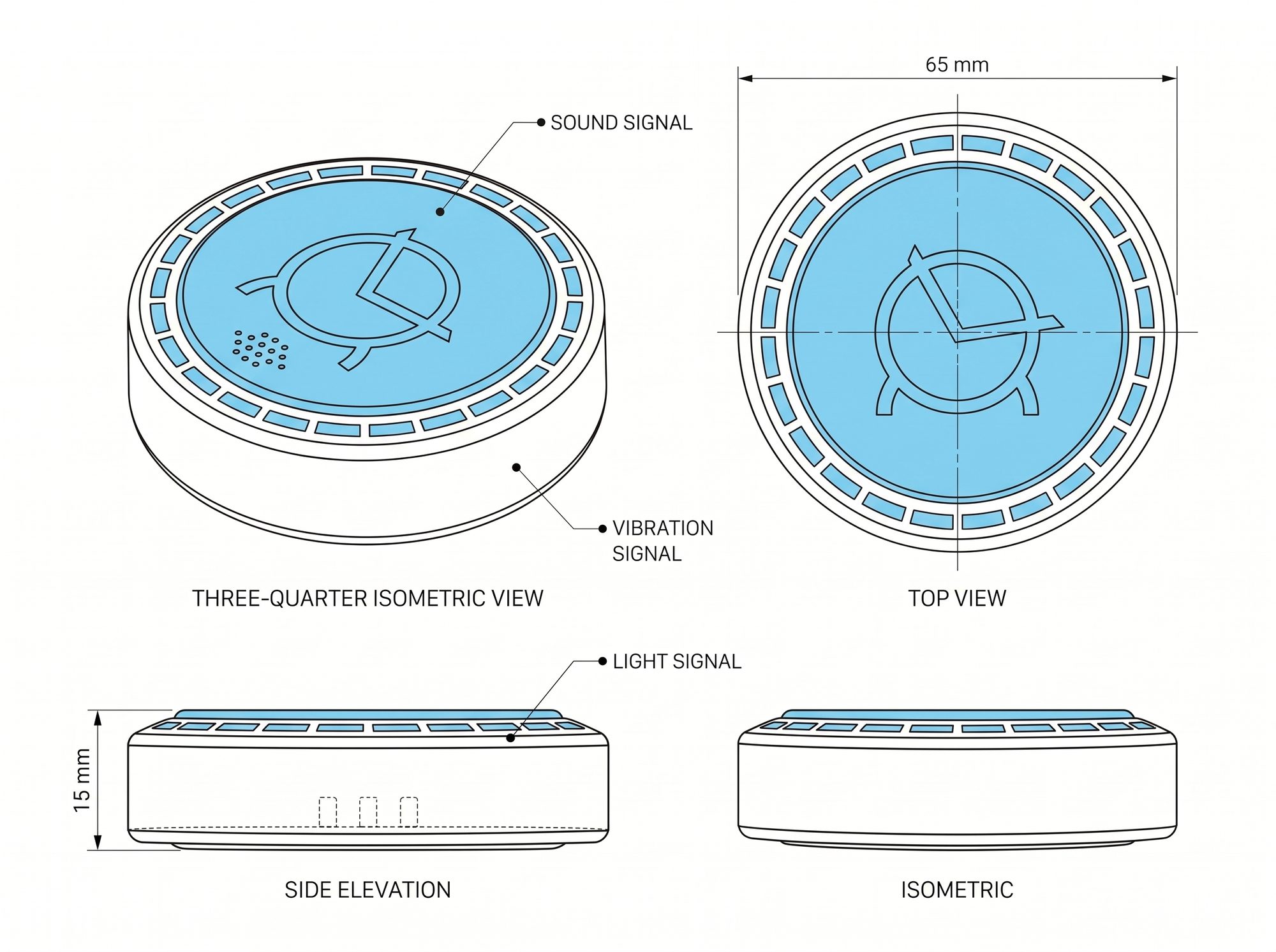
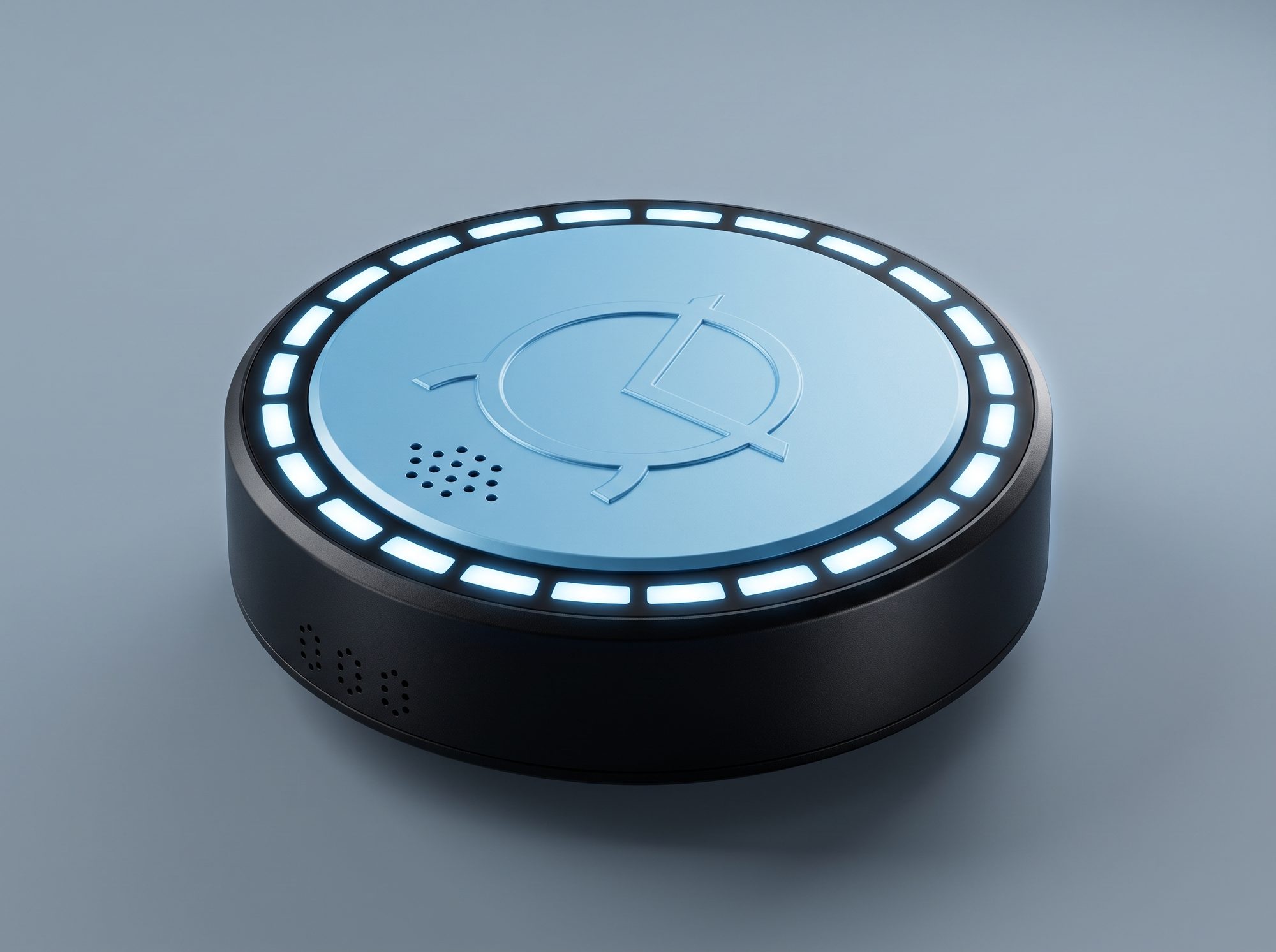
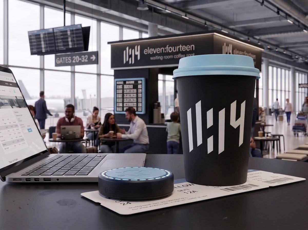
at order time, the customer scans their boarding pass at the counter or kiosk, and that flight data is pushed to a small puck-shaped reminder device handed over with the drink. a ring of light around its edge tracks boarding status — steady while there's time, a shifting pulse as the window narrows — backed by a soft vibration and a quiet chime as it's time to move.
three signals, not one, so the alert reaches everyone: light for those who are deaf or hard of hearing, vibration and sound for those who are blind or low vision, and all three together for anyone with headphones in or a phone buried in a bag. no single sense has to do all the work.
why this direction works:
- an alert that [actually] alerts — it interrupts the moment boarding approaches, rather than relying on a glance down
- built-in inclusivity — redundant signals mean the device works regardless of a traveler's hearing or vision
- a tangible brand object — sleek, minimal, unmistakably eleven:fourteen
- room to grow — gate changes, multi-flight tracking, without being boxed in by a small display
kept small (65×15mm, pocket- or lanyard-friendly) and simple to hand off and return, so the friction stays low while the concept still has real presence.
why this concept works
people already treat coffee runs as a countdown at the airport. you order, you wait, you watch the gate board out of the corner of your eye the whole time. the reminder device fits right into that habit instead of asking travelers to change it.
it also fixes a real problem: gate changes and boarding calls get missed constantly, especially in loud terminals or when someone's absorbed in their phone. a small object that lights up, buzzes, and chimes solves that without needing an app or a notification setting.
there's an anxiety piece here too. a lot of the stress at a gate comes from having to stay alert the whole time — checking the board, checking the phone, never fully settling in. once the device is handling that job, people can actually relax. paired with a shop designed as a waiting room rather than a quick counter.
and it gives the brand something to hand over besides a cup. most coffee chains blend together at the airport. a physical device with the eleven:fourteen look on it is something people notice, ask about, and remember.
why airport-only
bus and train stations don't gate boarding behind a scannable pass the way flights do, so the core mechanic — scan pass, get a live reminder — has no equivalent there. airports are also where wait-anxiety peaks (security, gate changes, longer buffers), which is exactly the territory the brand claims. staying airport-only keeps the concept sharp: one audience, one anxiety, one very specific solve.