case

buenos tacos

a taco window in Lutsk
what we did
research, identity, space concept
scope
logo, identity, packaging, menu, print, shopfront
place
Lutsk, Ukraine
year
2025–2026
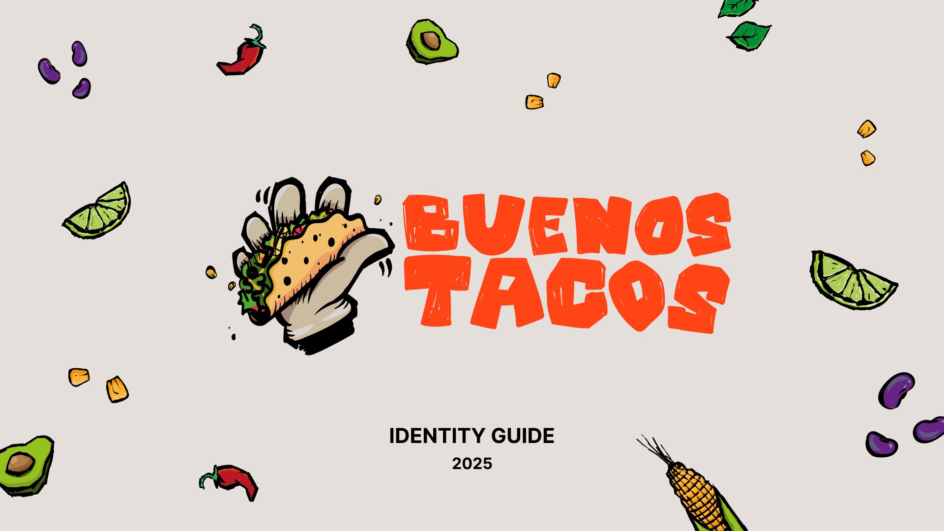
the buenos tacos wordmark beside a drawn taco held in a hand, on a warm grey ground scattered with chillies, limes and avocado

the brief

A taco window in a Lutsk shopping centre: takeaway and delivery only, no tables. Started by a Ukrainian veteran.

One hard condition: no sugar skulls. Mexican food abroad is sold with the same three pictures — Day of the Dead face paint, sombreros, a cactus. That imagery belongs to a two-day festival, and borrowing it to sell lunch says nothing true about Mexico or this business. So Dima started with research.


research

Dima read Mexican street culture the way an advertiser does: not what the world paints about Mexico, but what Mexican businesses put on their own walls, plates and signs. Four threads came back.
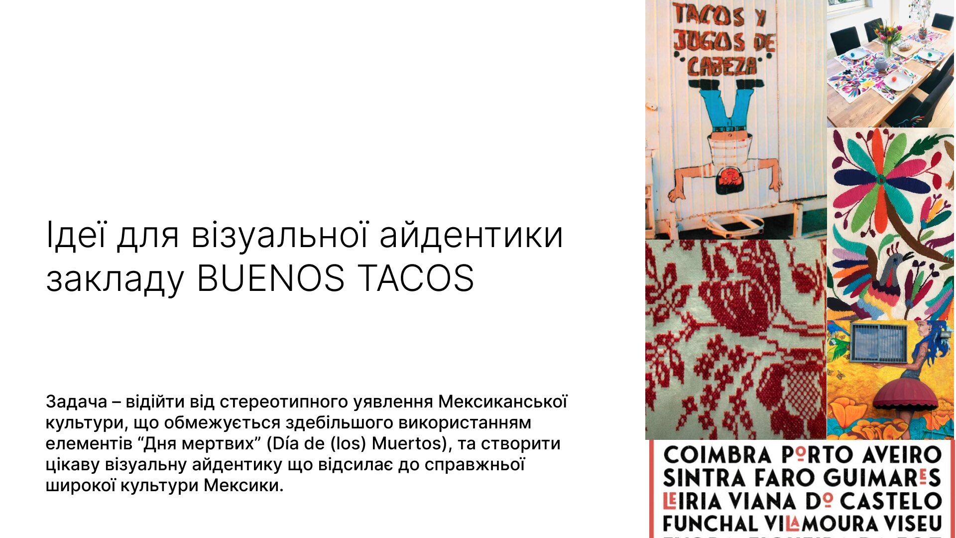
the opening page of the research document, stating the task: to move away from the stereotyped picture of mexican culture and build an identity that refers to the real, wider one
research, page one — the task as we set it
  • Muralism. Public, full height, colour. The argument for eight colours, not the safe three.
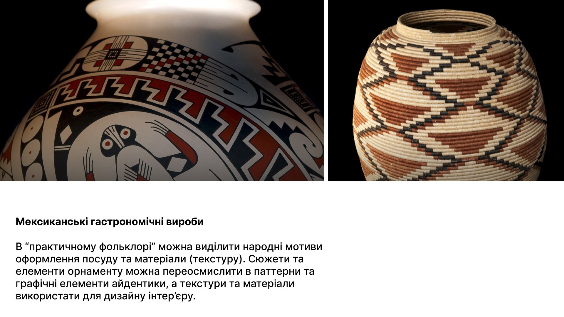
  • Practical folklore. Pottery and woven ornament as a pattern library: geometry to redraw and get inspired.
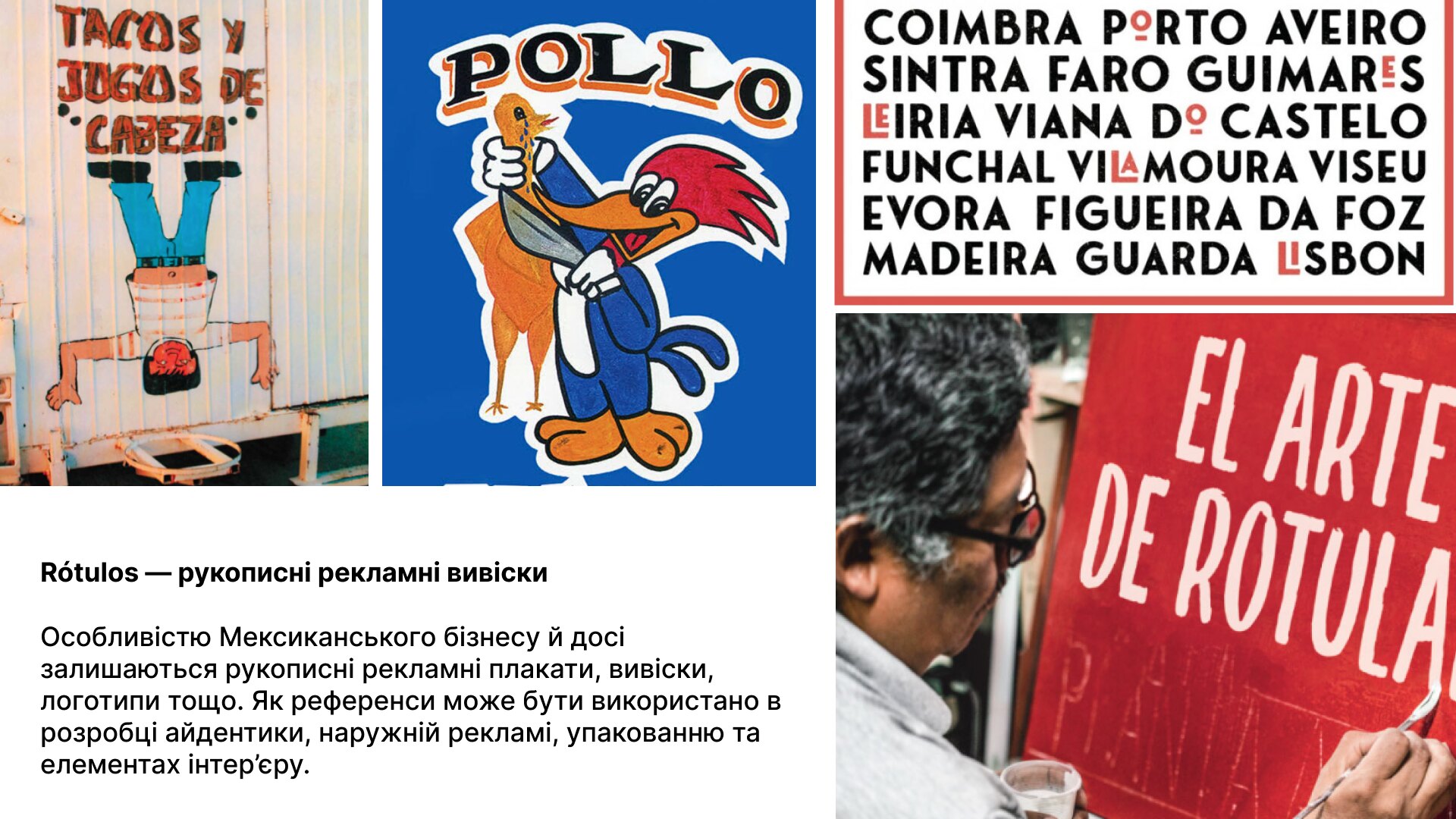
  • Rótulos. Hand-painted signs, letters drawn by a signwriter, never set from a font. Hence the wordmark is an illustration.
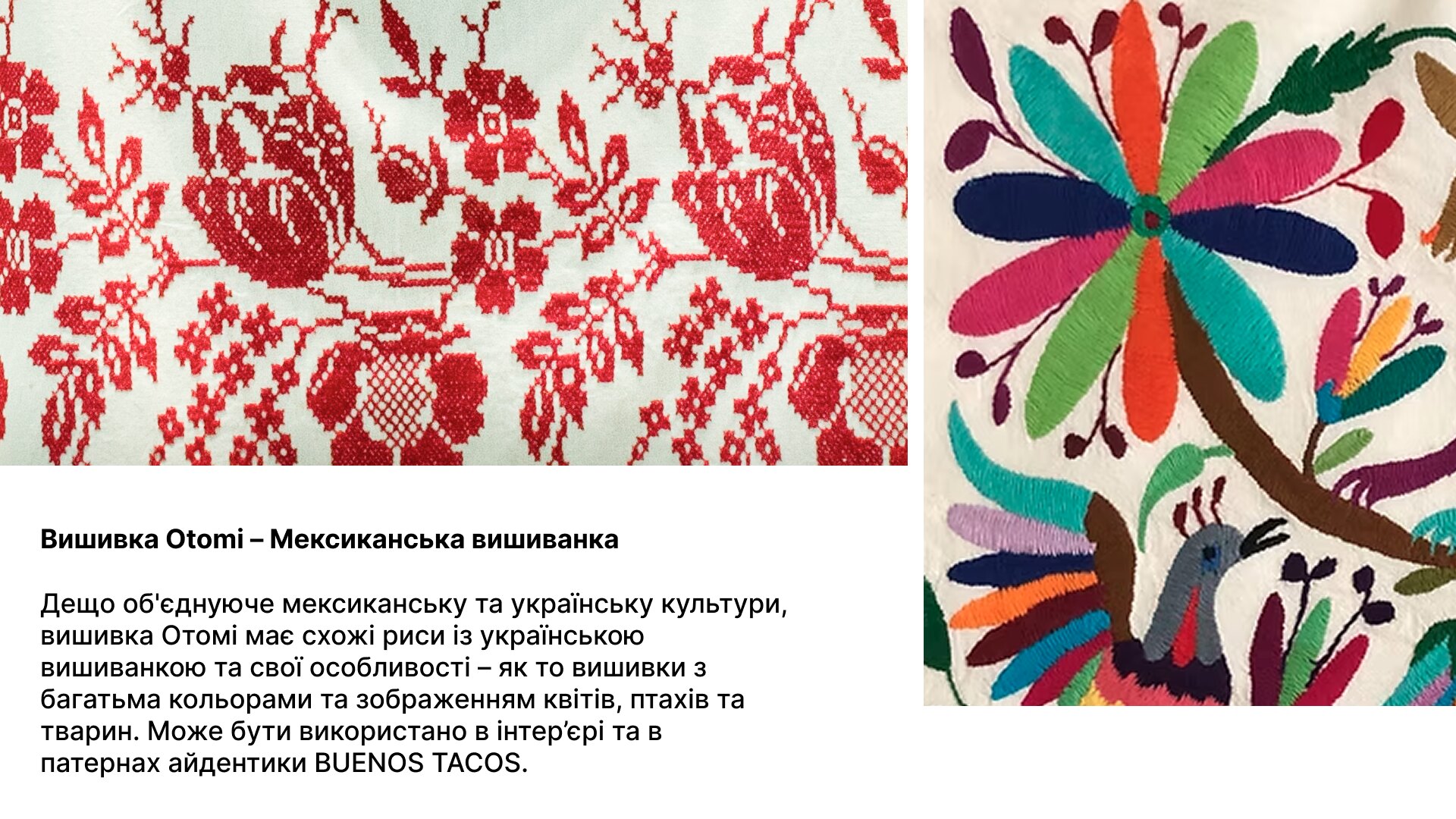
  • Otomí embroidery. Flowers, birds and animals on a pale ground, strikingly close to Ukrainian vyshyvanka. Two cultures that never met decorate cloth the same way. For a Mexican place in Lutsk, that is the bridge the whole identity stands on.
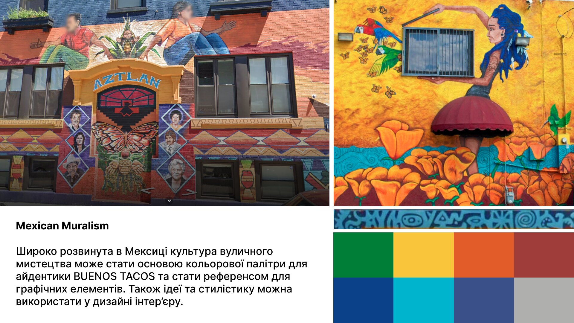
research page on mexican muralism: painted facades and a strip of colours taken from them
Mexican muralism — the colour argument
research page on mexican pottery and woven vessels, with their ornament read as a pattern source
everyday pottery — ornament as a pattern library
research page on rótulos, the hand-painted signs mexican businesses still advertise with
Rótulos — lettering drawn, never set
research page comparing otomí embroidery with ukrainian vyshyvanka: flowers, birds and animals in many colours on a pale ground
Otomí embroidery beside Ukrainian vyshyvanka

Reference photos belong to their authors.


the mark

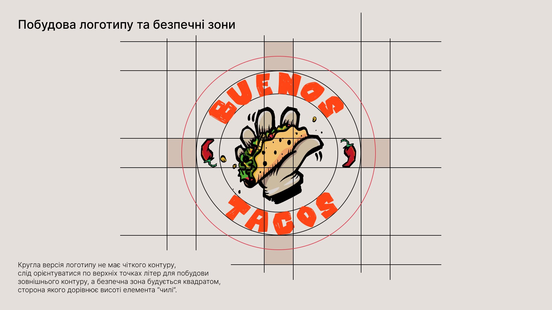
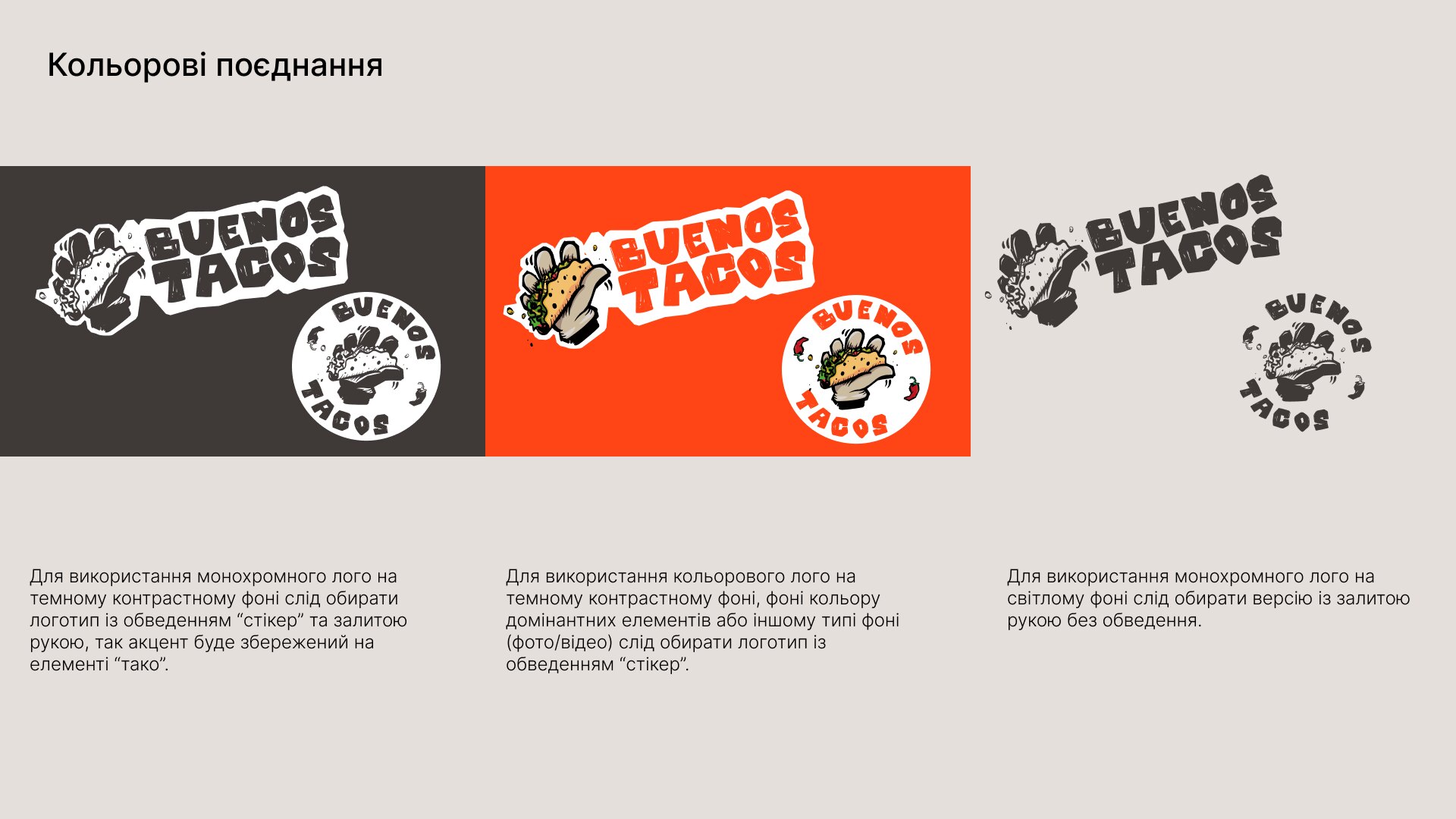
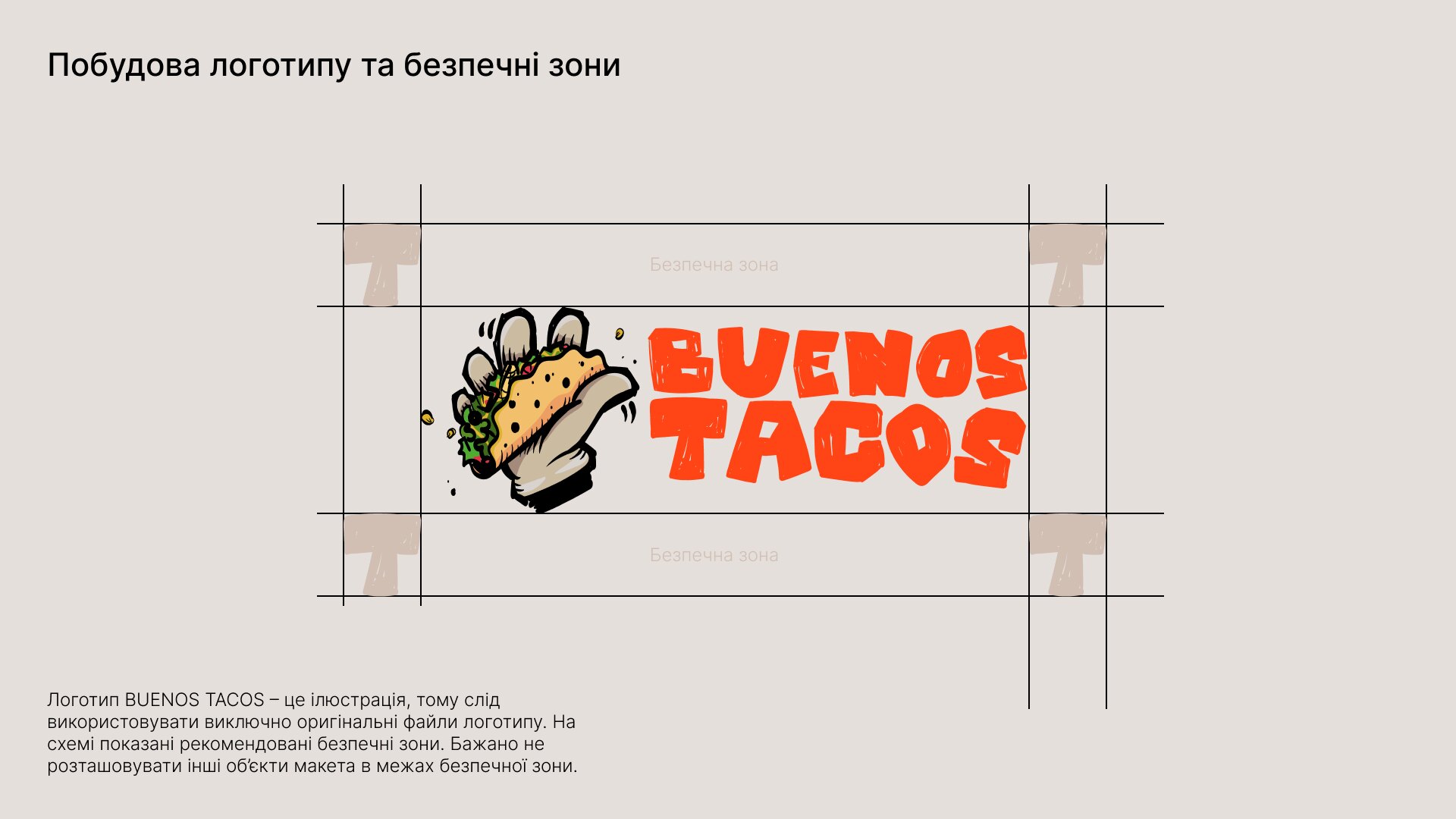
A taco held in a hand, drawn by hand. The wordmark is lettering, not type, so it is always used from the original files. Dima's guide sets clear space, a round version for stickers and signs, and which version goes on which ground.
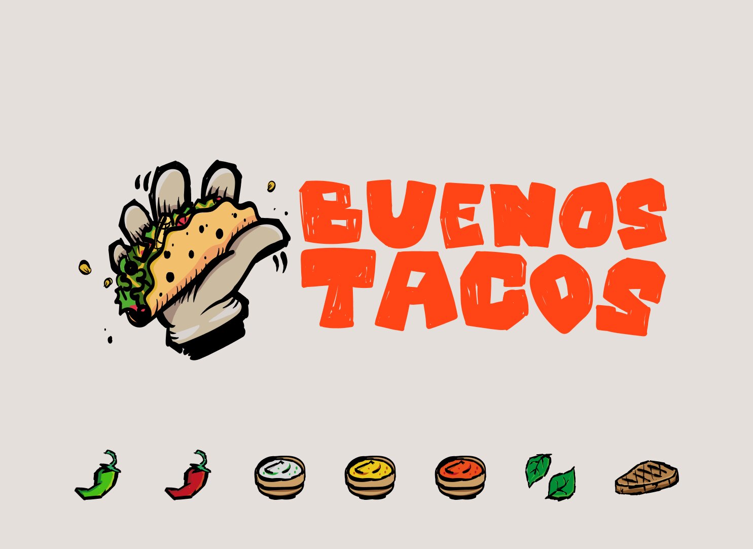
the horizontal lockup on a light grey ground, with a row of drawn ingredients beneath it
the horizontal lockup
a guide page showing the horizontal logo on a construction grid with its clear space marked
clear space, horizontal lockup
a guide page showing the round version of the logo built inside a circle and a square
the round version
a guide page showing the monochrome logo on dark, the colour logo on red and the monochrome logo on light, each with its rule
which version goes on which ground
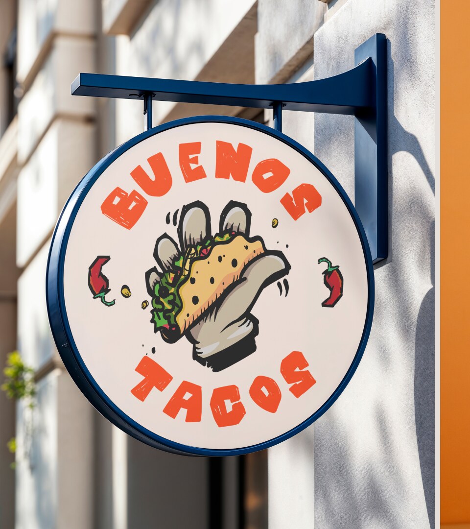
the round mark as a projecting sign on a bracket against a facade
the round mark as a projecting sign

palette

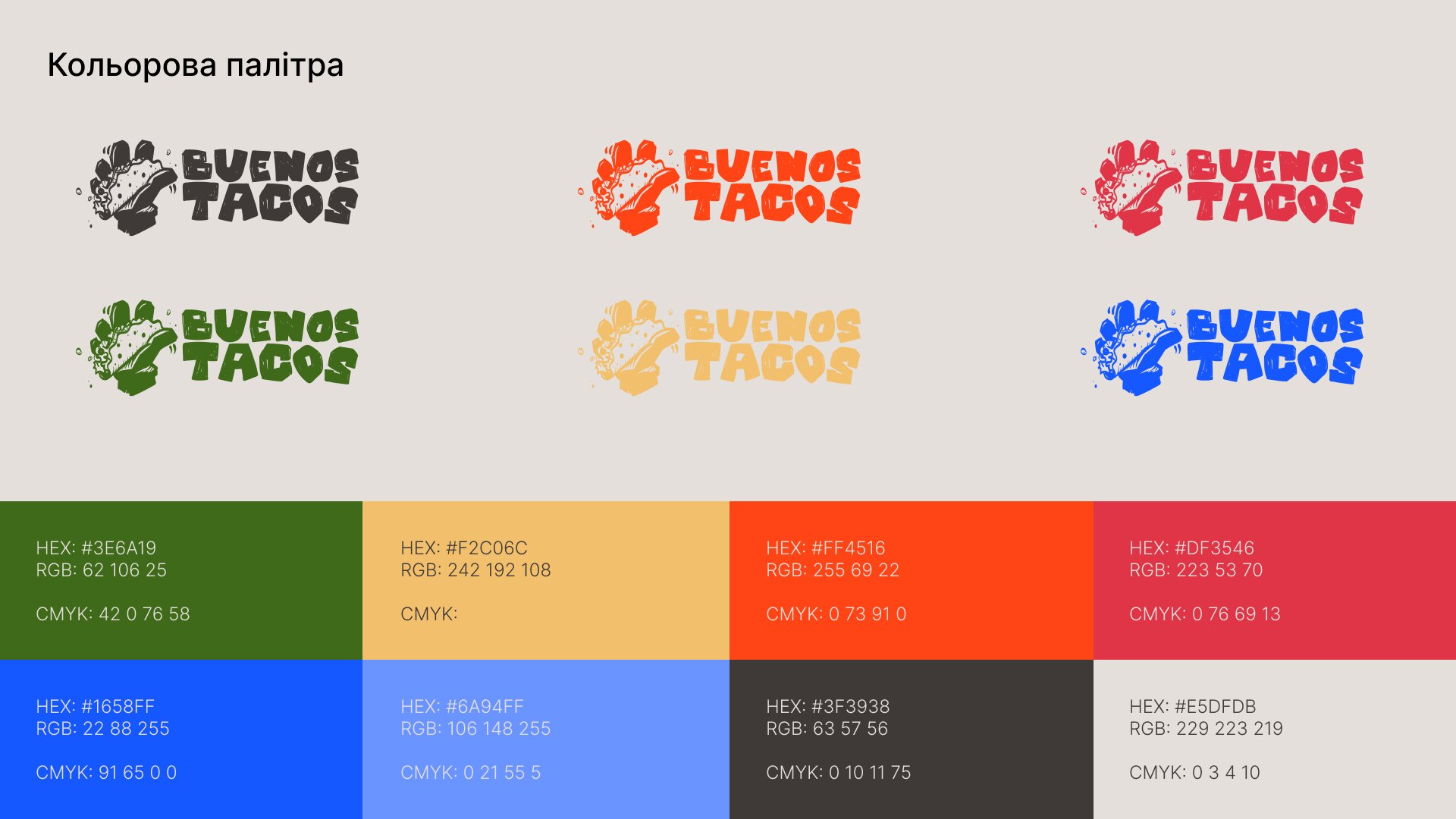
ff4516 chilli
df3546 hibiscus
3e6a19 lime leaf
f2c06c corn
1658ff cobalt
6a94ff sky
3f3938 ink
e5dfdb adobe
the palette page of the guide: the logo shown in six of the colours, with the full set of values below
the palette page of the guide

type and elements

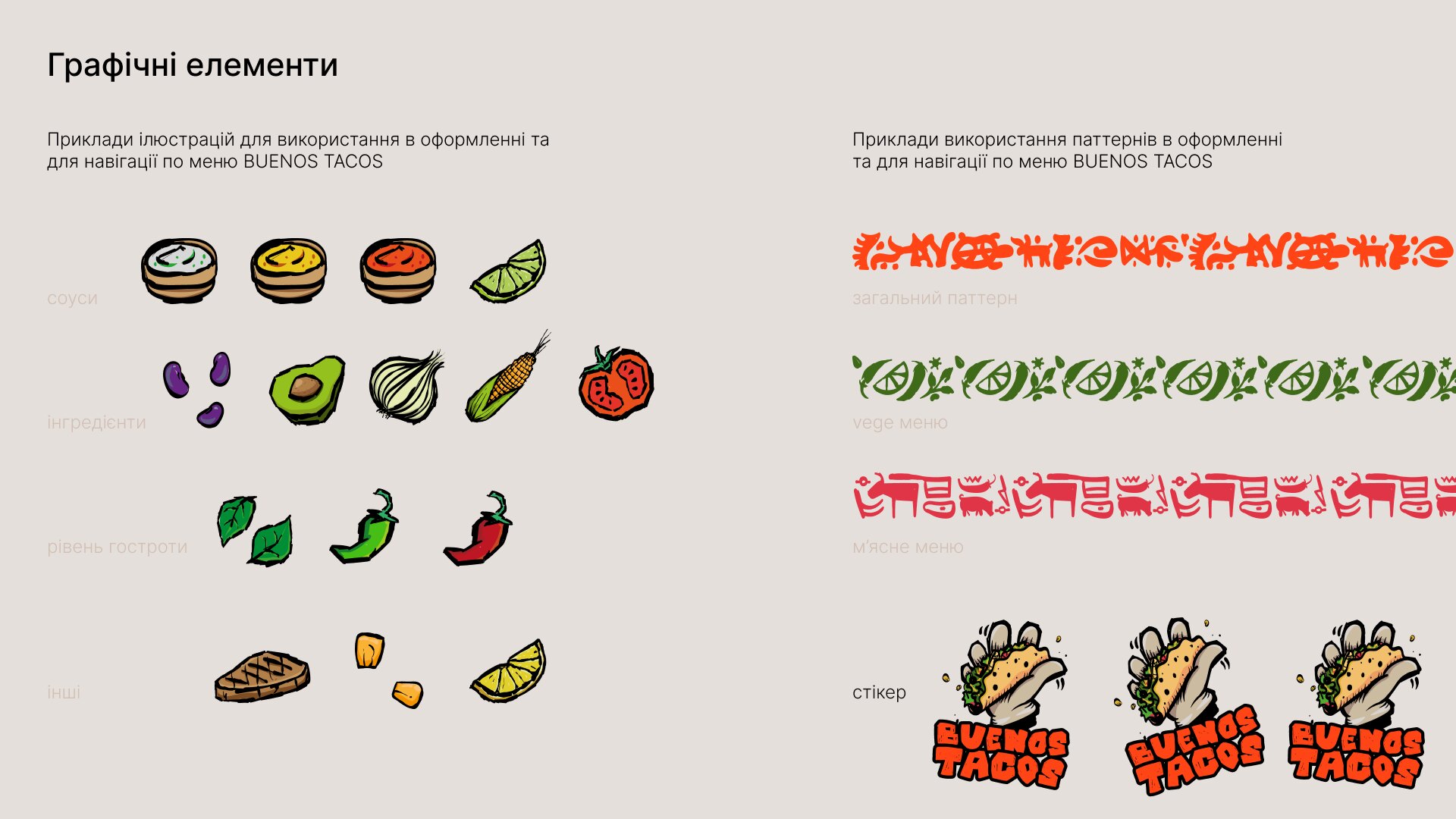
Foo for headings, Coolvetica for text, both with Cyrillic. Plus a drawn set of chillies, limes, corn, avocado and salsa dishes, and two patterns built from it. One navigates the menu: an ingredient marks a section, so you find the vegetarian taco by looking, not reading.
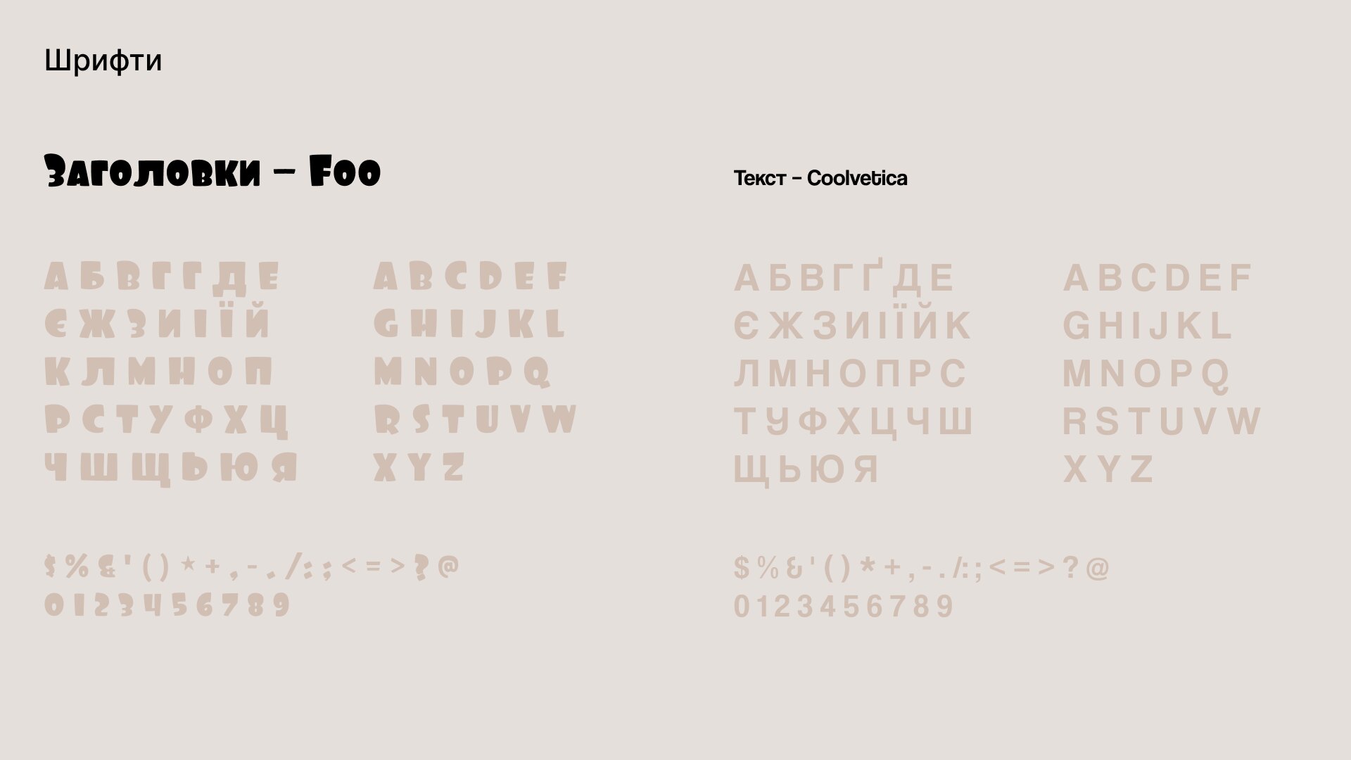
a guide page showing the foo and coolvetica alphabets in cyrillic and latin
Foo for headings, Coolvetica for text
a guide page showing drawn ingredients, two patterns built from them and three sticker versions of the logo
the drawn set and the patterns built from it
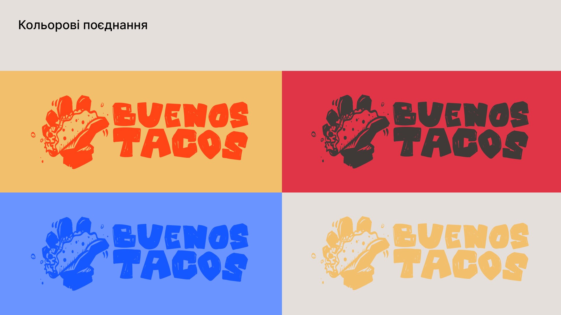
a guide page showing the logo on yellow, red, blue and dark grounds, with the outlined sticker version on photographs
colour combinations, and when the outlined sticker is used
a brand board on chilli red with the round mark centred and drawn ingredients scattered around it
the round mark on chilli
the same board on lime leaf green with the round mark centred and drawn ingredients scattered around it
the round mark on lime leaf
a brand board on chilli red carrying the ukrainian line that means the real taste of mexico, with a drawn steak
«спражній смак мексики» — the real taste of Mexico
the same line on lime leaf green, with a drawn avocado in place of the steak
the same line on green, with the avocado

packaging and menu

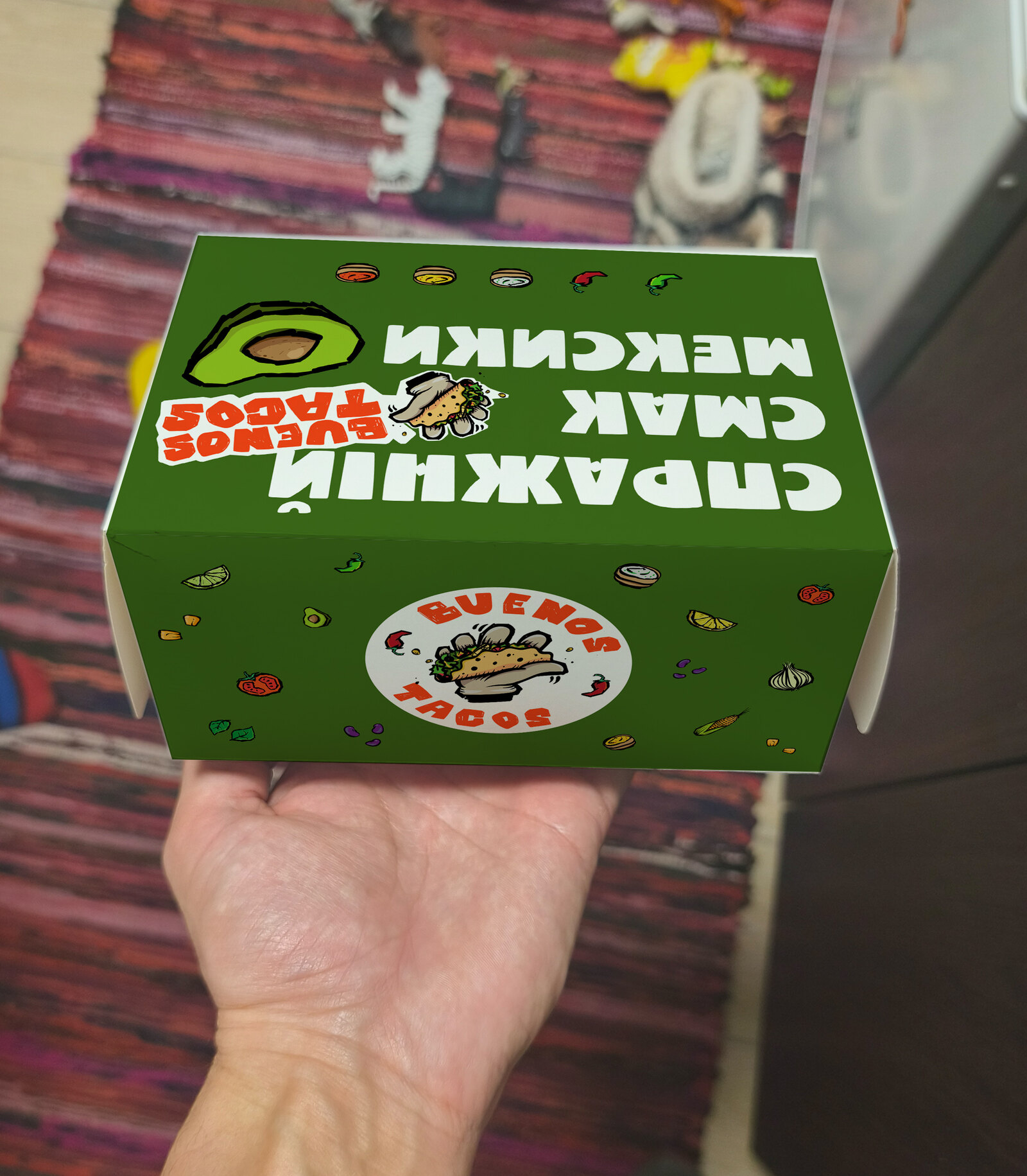
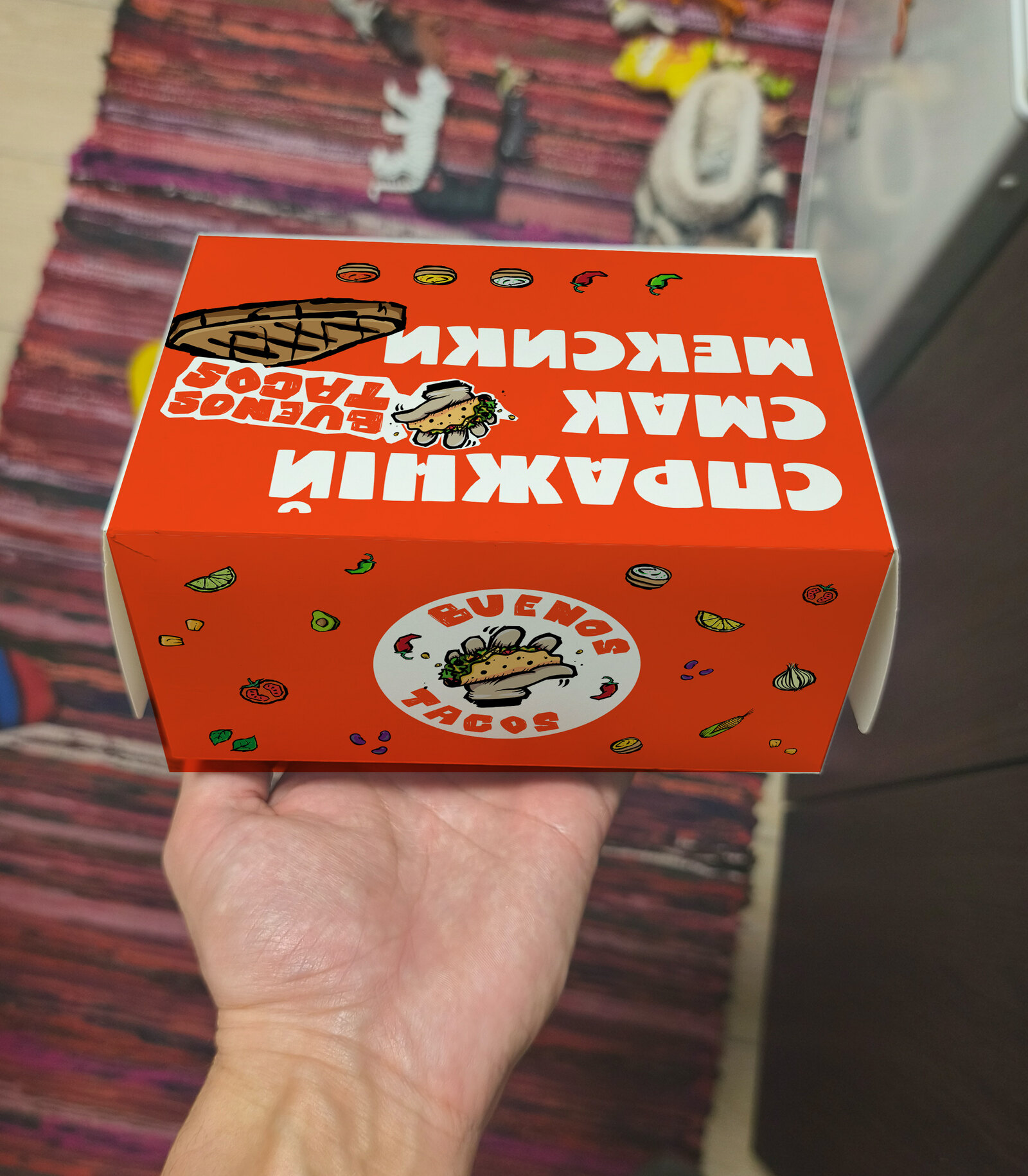
The box is the whole shopfront of a delivery order, the only piece of the brand in the room when it lands on a desk.

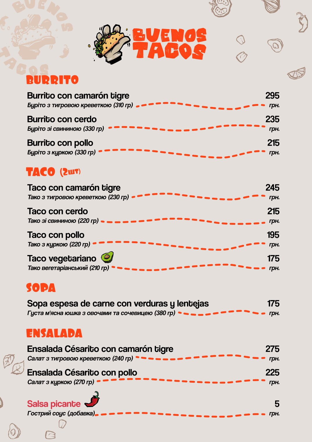
Every dish is named in Spanish, with a Ukrainian line and gram weight beneath. Nobody has to guess what a burrito con camarón tigre is, and nobody is talked down to.
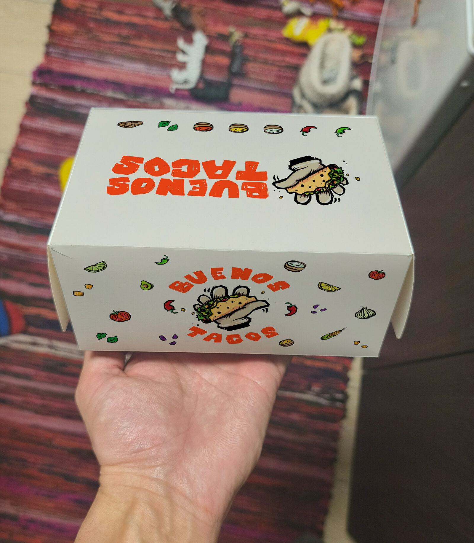
a white takeaway box held in a hand, printed with the logo and the drawn ingredients
takeaway box, light
the same takeaway box in chilli red, carrying the ukrainian claim across the lid
takeaway box, chilli
the same takeaway box in lime leaf green with the avocado version of the claim
takeaway box, lime leaf
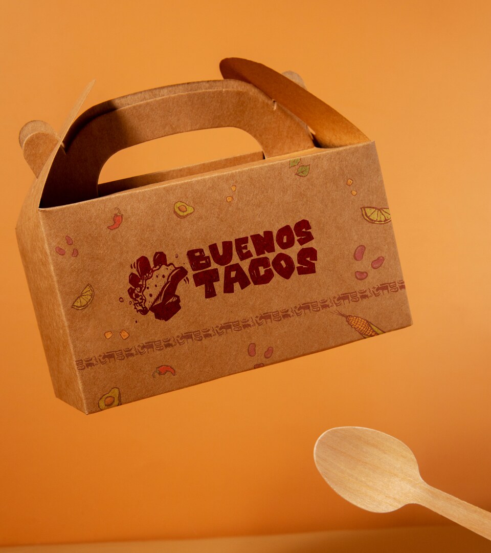
a kraft carry box with a handle, printed in one colour with the wordmark and scattered ingredients
kraft carry box, one-colour print
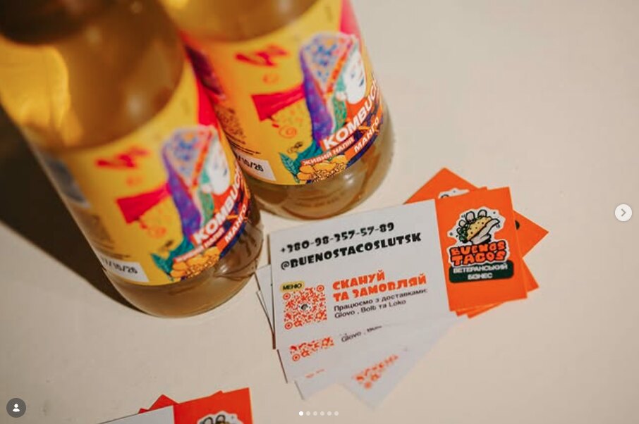
printed cards beside bottles of kompot: contact details, the instagram handle and a qr code to order
cards and drinks at the counter
the menu board: burrito, taco, sopa and ensalada sections, each dish in spanish with a ukrainian line under it and a price
menu — spanish name, ukrainian line, weight, price

the front

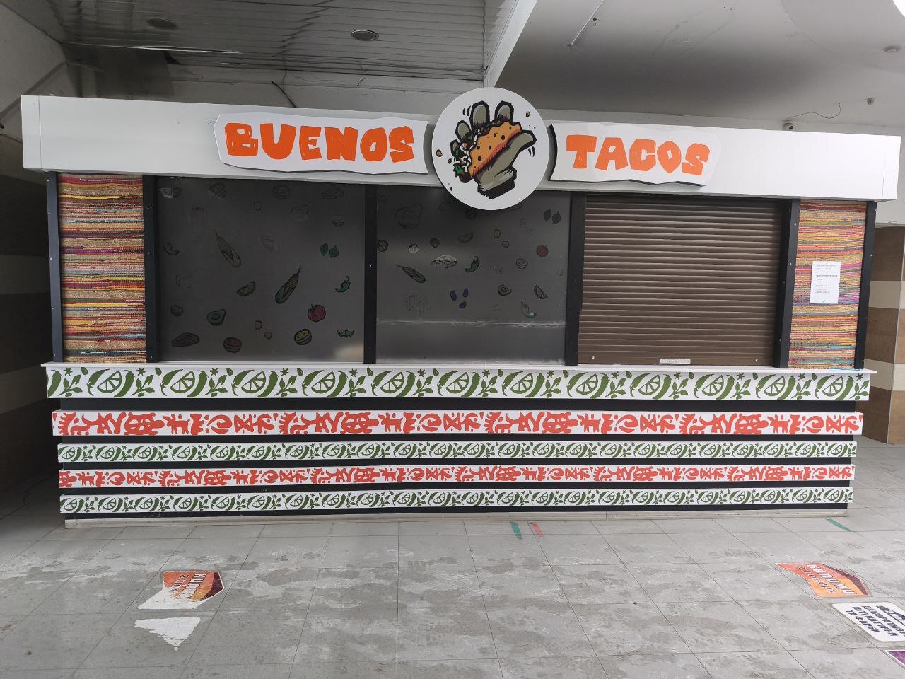
No interior to design: the public only sees the counter, fascia and window. So the counter became the pattern, bands of ingredients and rótulo lettering stacked like an embroidered border, with woven otomí-style panels at both ends.
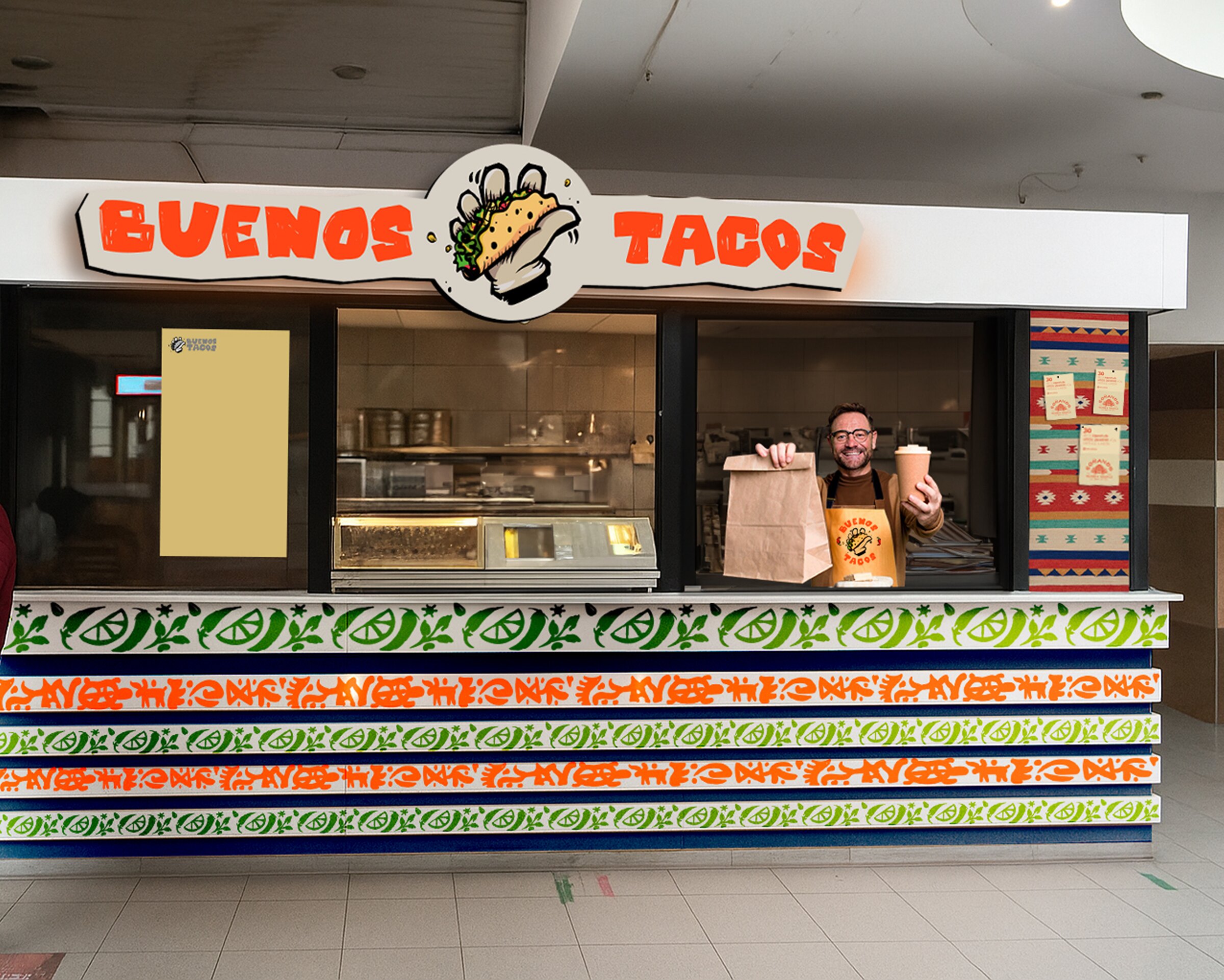
a visualisation of the counter: fascia sign with the round mark, banded pattern along the front and patterned panels at the ends
concept visualisation of the shopfront
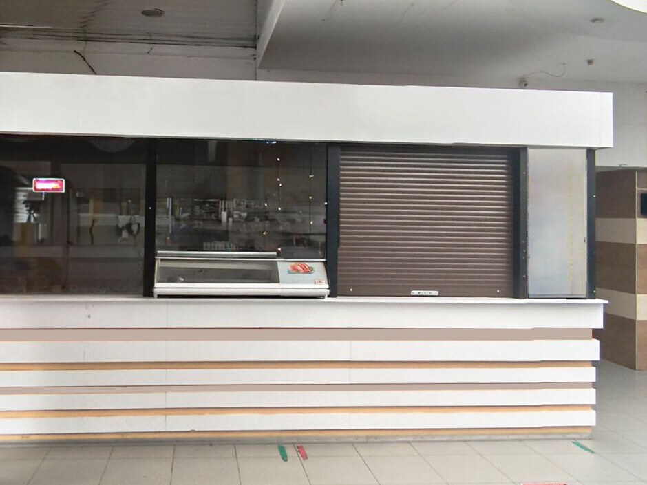
the unit before the work: a plain white slatted counter, a glass display case and a closed shutter
the unit before
the built shopfront: the wordmark and round mark on the fascia, banded patterns across the counter and woven textile panels at both ends
the built shopfront, Lutsk

in use

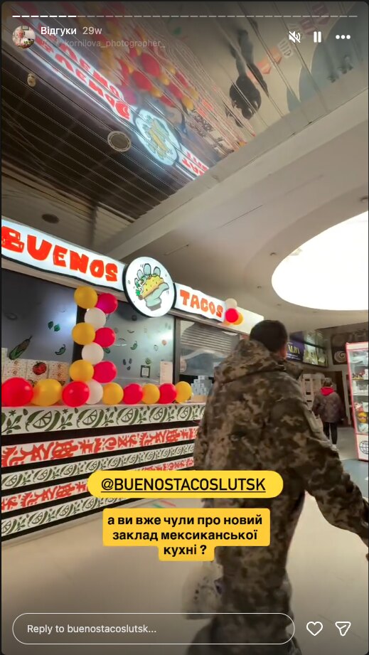
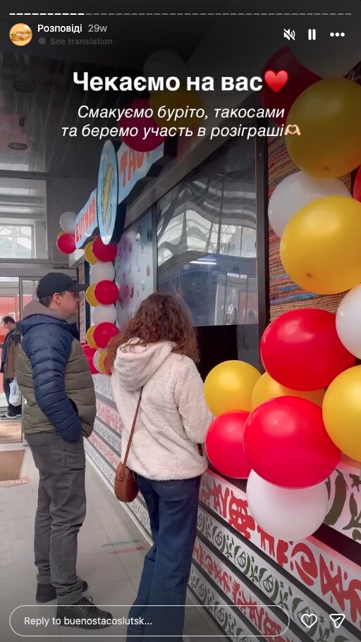
an identity stops being a file the day other people start photographing it. these are the venue's own stories from the opening week and a repost from a visitor — the boxes in a customer's hands, the counter with a queue at it, and somebody telling their followers that a mexican place has opened.
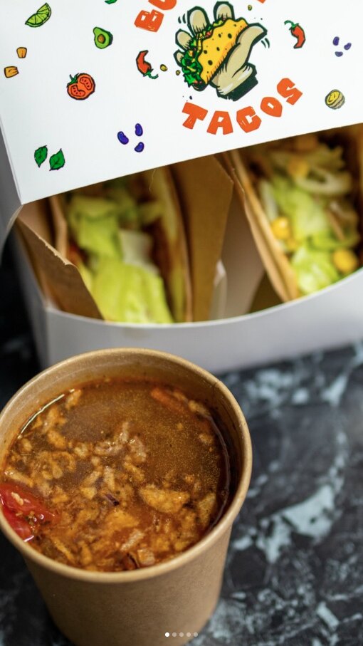
a story from the venue: an open box with two tacos and a cup of soup
the packaging in use
a story from the opening: balloons along the counter and customers standing at the window, seen from behind
opening week at the window
a visitor's story tagging the venue and asking their followers whether they have heard about the new mexican place
a visitor's repost

Buenos Tacos has served from that window since March 2026.